Nestle Case Comp
TYPE
Case Competition
ROLE
Product Designer
DURATION
4 Weeks
ORGANIZATION
Berkeley
A product design and branding project for Nestle's new campus food initiative, focusing on creating convenient, nutritious breakfast options for busy college students.

The Challenge
Nestle challenged our team to develop a new food product targeting college students that addressed their unique needs and pain points. As the lead designer on the team, I worked alongside a Berkeley business student to create a product that would be both appealing and practical for the campus environment.
Key Constraints
- Create a product that fits into students' busy schedules
- Ensure nutritional value while maintaining appeal
- Design packaging that stands out and communicates value
- Develop a feasible go-to-market strategy for campus environments

User persona analysis identifying key pain points
Market Research
We began with extensive market research to understand student needs and preferences. Our analysis revealed that 67% of students prefer light and healthy snacks, with a growing demand for convenient breakfast options (7.4% CAGR). We also found that student interest in traditional fast food was declining, presenting an opportunity for healthier grab-and-go alternatives.

Market analysis showing student trends and competitive landscape
Our Solution: Wrapped & Hot Burritos
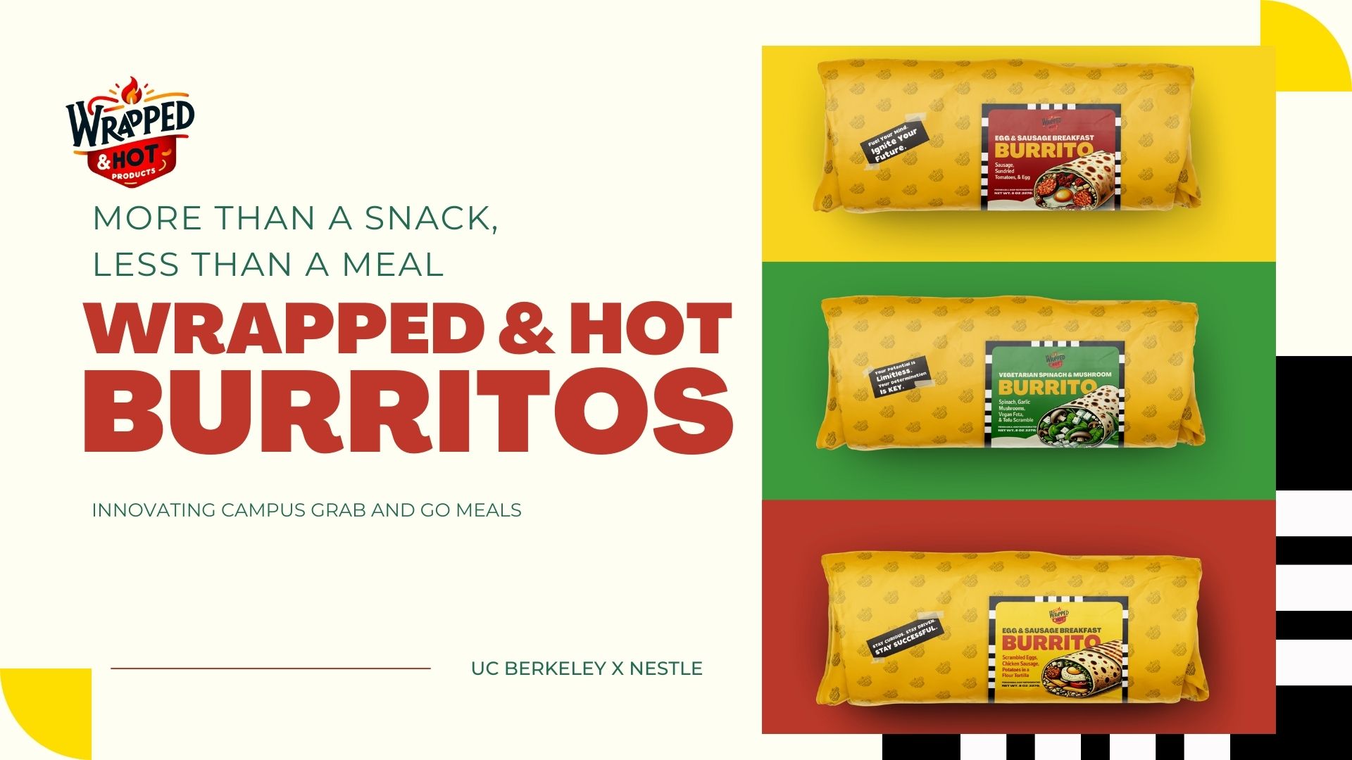
Based on our research, we developed "Wrapped & Hot" - a line of breakfast burritos designed specifically for college students. The product concept centered around being "more than a snack, less than a meal" - providing nutritious, convenient food that could be eaten on the go between classes or during study sessions.

Product concept with multiple flavor options

Consumer research and product features
Design Process
As the product designer, I focused on creating packaging that would appeal to college students while communicating the product's value. I developed a distinctive yellow wrapper with motivational messages to create an emotional connection with stressed students. The color psychology was carefully considered: yellow for happiness and friendliness, red for appetite stimulation, and green to convey freshness and health.

Packaging design with color psychology explanation
Go-to-Market Strategy
We developed a three-phase market entry strategy focused on campus integration. Our approach leveraged the university's social media culture and student organizations to create awareness and drive adoption. Key performance indicators included social media engagement, repeat customers, and inventory turnover.

Three-phase market entry strategy

Social media marketing strategy
Results & Impact
Our team was awarded first place in the competition. The judges were particularly impressed with the comprehensive design approach that considered both functional needs (nutrition, convenience) and emotional aspects (motivational messaging, color psychology). Nestle representatives expressed interest in further developing the concept for potential market testing on select college campuses.

Final product lineup presented to Nestle executives
Reflections
This project taught me valuable lessons about designing products that address both functional and emotional needs. Working alongside business students helped me understand how design decisions impact marketing strategy and business viability. The experience strengthened my skills in user research, packaging design, and presenting design concepts to stakeholders with varying priorities.
Key Learnings
- The importance of understanding user context when designing food packaging
- How color psychology and messaging can create emotional connections with consumers
- Techniques for presenting design concepts to business stakeholders
- Balancing aesthetic appeal with practical considerations like shelf life and distribution